Minnesota’s new state flag faces the toughest critic: Fourth graders
Published 5:25 pm Friday, April 26, 2024

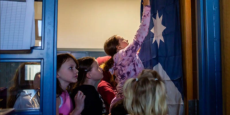
- Students in Jason Benjamin’s fourth grade class rush to hang a new Minnesota state flag on the door after flag commissioner Anita Gaul presented them with it at Burroughs Community School on Thursday. Nicole Neri for MPR News
|
Getting your Trinity Audio player ready...
|
By Estelle Timar-Wilcox
Minnesota’s new state flag faced a room full of tough critics today: Jason Benjamin’s fourth-grade class at Burroughs Community School.
Anita Gaul, the vice chair of the State Emblems Redesign Commission, stopped by the Minneapolis class on Thursday and gifted students their own brand new flag and seal. They’re among the first kids in the state to get the symbols for their class.
But they weren’t all impressed.
“It looks like a flag for the ocean,” one student said. “It’s all blue.”
The Minneapolis students are no strangers to the flag selection process. In December, vice chair of the State Emblems Redesign Commission Anita Gaul came to the class to give a presentation about the process.
At that point, the commission had yet to vote on its final design. Gaul fielded comments from the kids and took their feedback to the meeting.
But the class’s top pick was ultimately turned down. Back in December, the students gave mixed reviews of the flag that ended up on top: one deemed it “too flaggy.”
On Thursday, Gaul returned to Mr. Benjamin’s class to tell them about the end of the selection process. She asked for the class’s honest opinions.
“Too simple,” one student said. “I don’t like the star that much,” another added.
Several bemoaned the loss of the three horizontal stripes that adorned the initial design of this flag. The white, representing snow, is gone, as is the green, representing land and forests.
It wasn’t all bad, though. Some kids spoke up to defend the colors. Some liked the simplicity of it.
“I like the star,” one student said. “I like how the darker blue looks like Minnesota.”
The fourth-graders aren’t alone in their skepticism. Minnesotans have leveled a variety of critiques at the new flag, from complaints about the final design to complaints that the old flag was replaced at all. The chair of the Minnesota GOP put out a statement denouncing the design; a handful of counties have passed resolutions expressing their dissatisfaction with the redesign process.
Gaul has been busy educating people about the flag. She said she’s traveled to historical societies and museums across the state to explain how the commission picked it. Education seems to help.
“There’s a lot of resistance to it because people don’t understand,” Gaul said. “You can kind of see light bulbs go off.”
For the fourth graders, she points out the north star, the shades of blue symbolizing a river, and the outline of Minnesota. Plus, she notes, the simplicity can be a good thing. Flag experts agree: a simpler design is more eye-catching and memorable.
“It looks simple, I know,” Gaul told the class, “but it has lots of beautiful symbolism that is meaningful to our state and who we are and what we’re all about.”
Some of the fourth graders had that light-bulb moment; some weren’t convinced. But they mostly agreed that it’s a step up from the old flag.
And, after two lengthy deliberation sessions on the class rug, marked by a distinct lack of decorum and no small amount of yelling, they admitted the commission had a hard task of narrowing down more than 2,000 submissions to a final flag.
“I think if it were our class, it would take, like, five hundred days,” one student estimated.
The new flag will be raised at buildings across Minnesota on May 11, statehood day.
Despite the critics, the students — or most of them, anyway — gave a round of cheers and applause when Gaul gifted them their own flag. Kids jumped up from the rug to help Benjamin hang it on the door.
They’ll see it on their way in and out every day — and maybe remember the little role they played in getting it here.
“To be part of a little bit of Minnesota history — that’s just awesome,” Benjamin said.


